Strict rules do not apply to the use of colour on shaded relief. Cartographers sometimes use colour in a more impressionistic way to emphasize the three-dimensional appearance of shaded relief.
On maps of this kind, colour changes are typically dependent on elevation, exposition and land use.
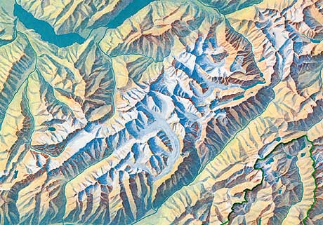
“Relief de la Suisse” (section Bernese Oberland/Goms) by Eduard Imhof, 1982, original scale 1:300,000. Available from © swisstopo.
Other examples of artistically coloured shaded relief:
- Mount Rigi by Fridolin Becker, with yellow and a subtle touch of red-purple at the highest elevations.
- Walensee, map painting by Eduard Imhof.
- St. Moritz, Oberengadin and Bernina by Kümmerly+Frey.
- Carte de la Principauté de Neuchâtel by Jean-Frédéric d’Ostervald, depicting the land use of his time.